Imagine you’re running a small island economy (like Gilligan meets Shark Tank). You’ve got two choices: grow pineapples or catch fish.
But you can’t go all in on both — life’s full of trade-offs. This, friends, is where the magic of the production possibility chart (aka the PPC or PPF) comes into play.
Now let’s tackle the big question: how does a production possibility chart assist in outlining opportunity cost? Grab your graph paper and economic sass, because we’re diving into this concept with style.
First, What Is a Production Possibility Chart?
Before we answer how a production possibility chart assists in outlining opportunity cost, let’s make sure we know what we’re talking about.
A production possibility chart is a graphical representation of all possible combinations of two goods or services that can be produced within a given time frame using fixed resources and technology.
Think of it as an economic buffet. You can’t eat everything — so what you put on your plate reflects what you leave behind.
It usually looks like a curved line — that curve tells us we can’t have everything, and doing more of one thing usually means doing less of another. Welcome to the grown-up world of trade-offs.
So… How Does a Production Possibility Chart Assist in Outlining Opportunity Cost?

Now for the big juicy answer. Here’s how:
1. Visualizing Trade-Offs Like a Boss
When you shift production from one good to another along the PPC, it visually shows what you’re giving up. That’s opportunity cost in action.
Example:
If moving from Point A to Point B on the chart means producing 5 more cars but 10 fewer laptops, your opportunity cost for 5 cars is 10 laptops.
So, how does a production possibility chart assist in outlining opportunity cost? It draws the sacrifice — clear, crisp, and graphically delicious.
2. Clarifying Efficient vs. Inefficient Choices
The chart also shows where you’re being efficient and where you’re just wasting time and resources. Any point on the curve = full efficiency. Any point inside = you’re slacking. Outside the curve? That’s dreamland — you’d need more resources or new tech to get there.
By showing these points, the chart helps businesses and governments understand what choices are most economically smart. It’s not just about what you’re giving up — but whether that sacrifice makes sense.
3. Highlighting Increasing Opportunity Cost
In most PPCs, the curve bows outward. Why? Because the more you specialize in one product, the more it costs to keep increasing it.
Why does this matter? Because it answers how does a production possibility chart assist in outlining opportunity cost with a real-world twist — sometimes, the cost of switching gears gets higher as you go. The chart shows this snowballing sacrifice.
4. Decision-Making Made Sexy (Okay, Sorta)
Whether you’re a CEO or just trying to decide between ramen and tacos for dinner, opportunity cost affects you. The PPC provides a sleek, simple way to break down complex decisions.
From startups deciding whether to invest in product A or B, to nations deciding how much healthcare versus military to fund — this chart is the OG decision-making tool.
So again, how does a production possibility chart assist in outlining opportunity cost? It lays out the “what ifs” with clarity that even your cat could understand (well, maybe).
5. Preparing for Growth and Innovation
PPCs can shift outward over time — and that’s good news. It means you’ve got more resources or better tech. But this shift doesn’t happen by accident.
Seeing the PPC helps leaders strategize: “Where should we invest now to grow the whole curve later?” Whether it’s education, research, or infrastructure, the chart shows not just current costs, but future potential.
How to Calculate Opportunity Cost

Now that you know what opportunity cost is, let’s break down how to calculate opportunity cost with a little bit of number magic.
Let’s say your economy can produce either:
- 100 cars and 0 computers
- Or 50 cars and 500 computers
If you choose to produce 50 cars instead of 100, you gain 500 computers.
That means the opportunity cost of those extra 50 cars = 500 computers.
So the opportunity cost of 1 car = 10 computers.
Formula:
Opportunity Cost = What You Give Up / What You Gain
It’s simple, it’s powerful, and it works in real-life budgeting, business, and economics.
How to Find Opportunity Cost Using a PPF
Learning how to find opportunity cost using a production possibility chart is easier than bingeing Netflix on a lazy Sunday.
- Identify Two Points on the Curve
Pick two combos of goods—say, Point A (80 shoes, 20 smartphones) and Point B (60 shoes, 40 smartphones).
- Calculate the Differences
You gave up 20 shoes to gain 20 smartphones. That means the opportunity cost of 1 smartphone = 1 shoe.
- Plot It
When these shifts are plotted on the curve, the slope between the points visually demonstrates the opportunity cost.
And boom—now you’re an econ ninja.
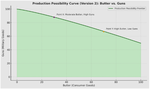
Real-Life Example: Guns vs. Butter
One of the most famous PPC examples: Guns vs. Butter.
This isn’t about a weird dinner party. It’s economics 101: If a country spends more on defense (guns), it may have to cut back on consumer goods (butter), and vice versa.
The PPC shows this trade-off in visual form — one curve, two options, and a clear representation of what gets sacrificed. So the next time someone asks how does a production possibility chart assist in outlining opportunity cost, hand them a chart full of artillery and dairy.
Bonus: Why the U.S. Cares Big-Time
This isn’t just textbook theory. U.S. policymakers, businesses, and financial analysts use PPCs to:
- Evaluate government spending
- Forecast economic growth
- Plan production
- Assess resource allocation
In fact, understanding how does a production possibility chart assist in outlining opportunity cost is vital for anyone making decisions with limited resources — which, spoiler alert, is everyone.
Charting Your Course: Why the PPC is the MVP of Economic Decision-Making
Let’s wrap this up with one final truth bomb: life is full of choices — and costs. Whether you’re producing Teslas or tacos, understanding opportunity cost is the key to smarter decisions.
So, how does a production possibility chart assist in outlining opportunity cost?
- It visualizes trade-offs.
- It shows efficiency.
- It reveals increasing costs.
- It guides real-world decisions.
- And it prepares us for growth.
In short, the PPC is the map that helps you navigate the economic jungle. It doesn’t make the decisions for you — but it makes those decisions a whole lot clearer.
Now go forth and plot your curve like a boss. Your future self (and your wallet) will thank you.